
Palestine: Putting Daily Life in the Picture

Did you know that since 1967, 800 000 olive trees have been uprooted in Palestine? It is the equivalent of demolishing 33 Central Parks.
Did you know a Palestinian in the West Bank is allotted only 70 liters of water per day, though the UN recommends a minimum of 100 liters per day? UK citizens benefit from 150 liters per day.
Did you also know that – excepting refugees – Palestinians have 5 types of ID cards, 4 of them issued by the Israeli government? The system limits where people can live, what services they can access, and how they can participate in the political system.
The reality of daily life for Palestinians is complex – difficult for an outsider to understand. But Visualizing Palestine took on the challenge of spreading the word, making “creative visuals to describe a factual rights-based narrative of Palestine/Israel”. Their work has led to a winning jury award for Social Activism at the Deusche Welle Best of the Blogs competition.
Transformed into appealing infographics, indigestible data and complicated details are made understandable for use in any campaign, on or offline. The project's goals include strengthening their messages to better reach their target population, thus increasing the impact of this information. The visuals – accessible in many forms and with a Creative Commons copyright – have been translated into a number of languages.
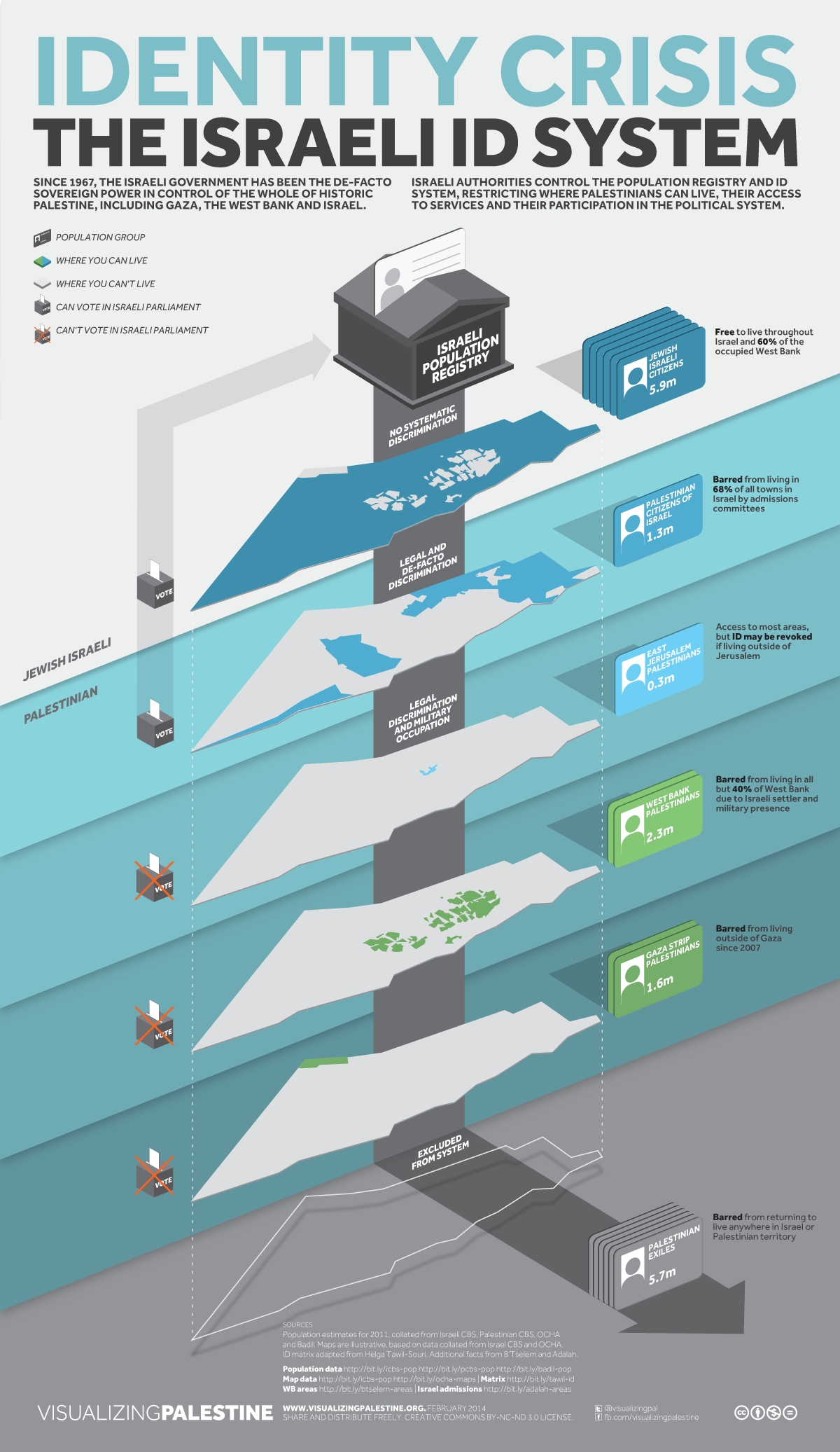
Identity Crisis: The Israeli ID System, Visualizing Palestine & Conor McNall (CC BY-NC-ND)
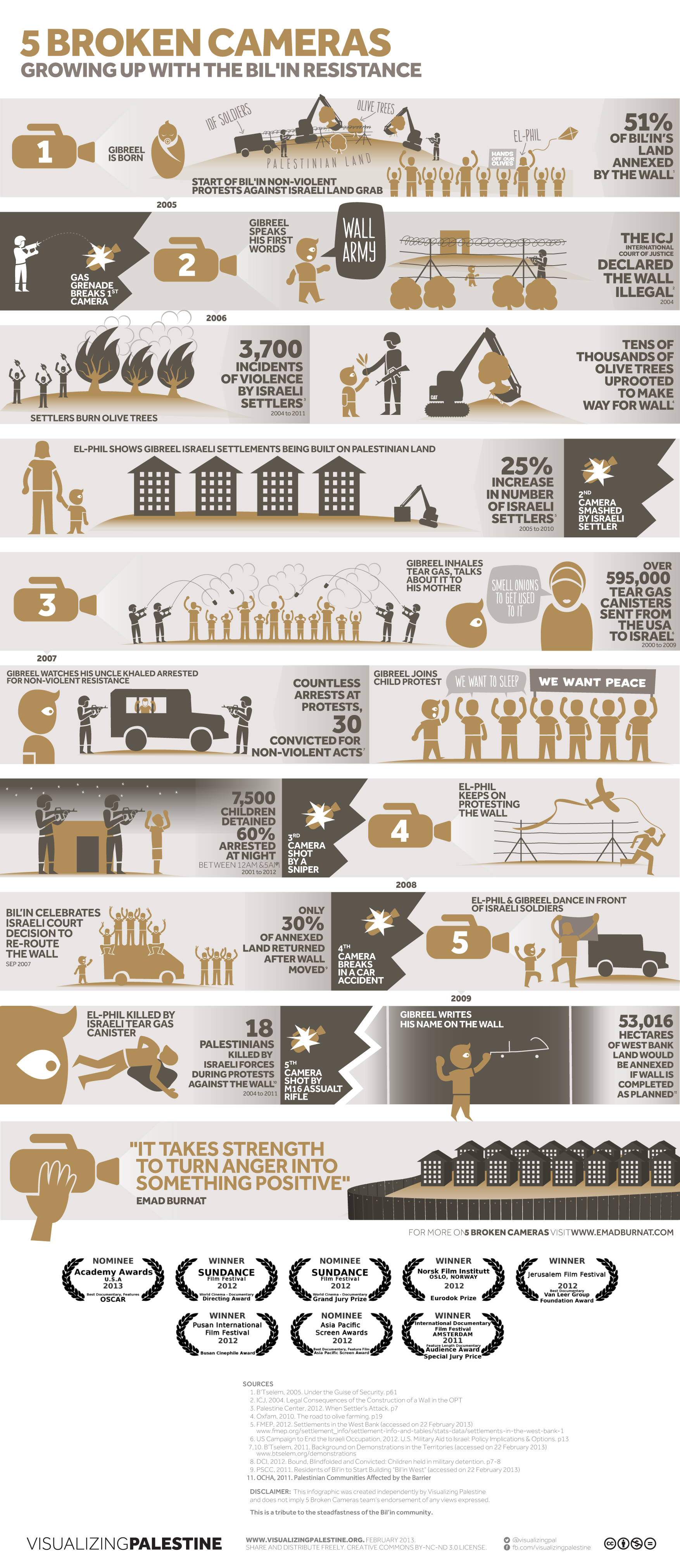
5 Broken Cameras: Growing up with the Bil'in Resistance, Naji Elmir is an infographic linked to the documentary film of the same name (CC BY-NC-ND)
The team has attracted attention since their first media was published in February 2012. They have been featured in many international publications, including Huffington Post, Fast Company, Al-Jazeera English, and Open Democracy, among others.
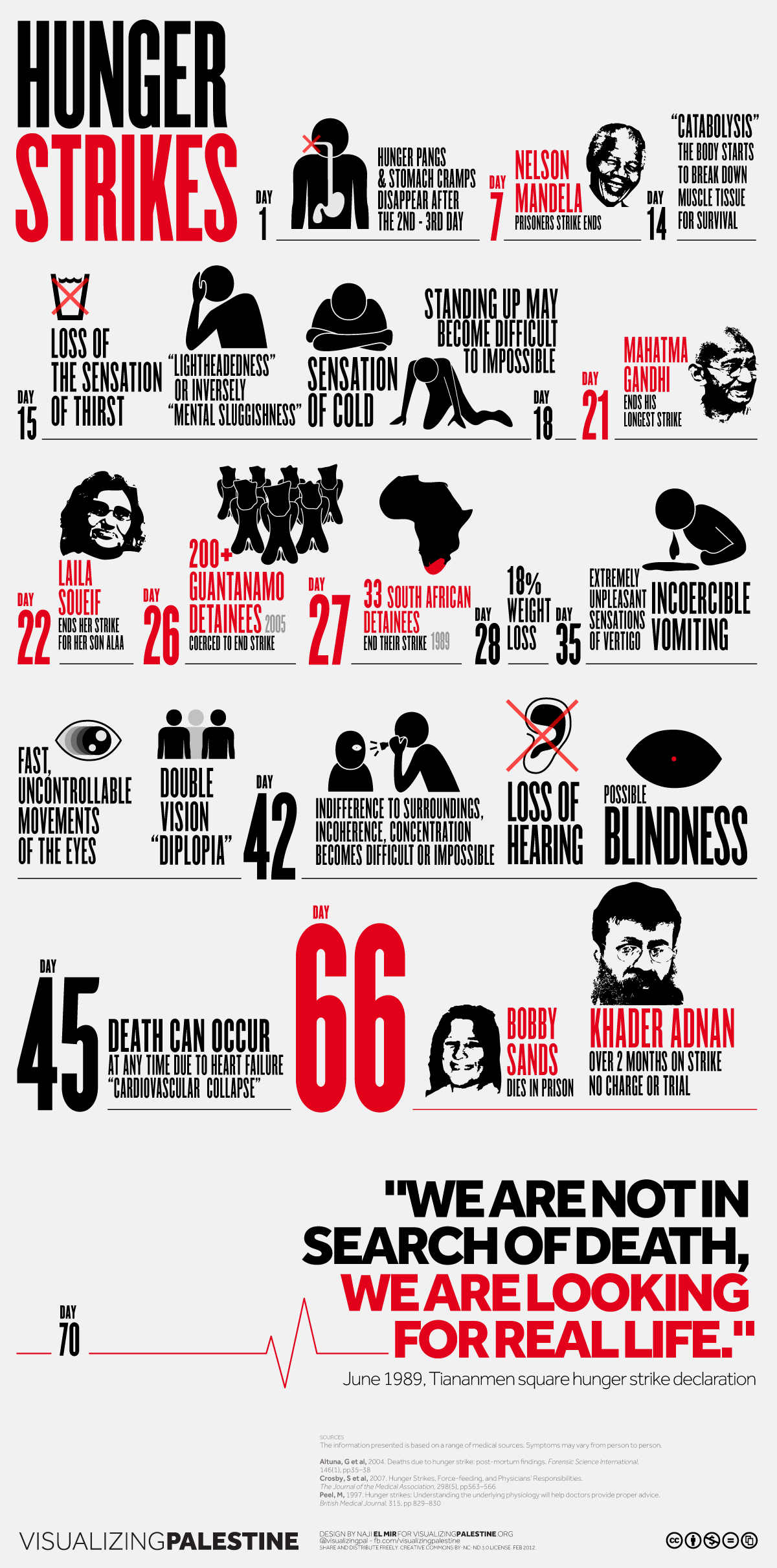
On Khader Adnan's hunger strike to protest detention without charges, Naji El Mir (CC BY-NC-ND)
Their process in obtaining the final picture final can be summarized in 8 steps:
- Identify new directions and ideas
- Research: get the raw data and validate the sources
- Story: make it into a compelling story
- Brief: translate it into a brief
- Design: bring in designers to express it visually
- Review the work to ensure quality
- Publish the work online
- Measure: track its impact and virality
All sources used are well documented on the Visualizing Palestine website – particularly important as reliable sources makes it difficult to refute the information presented.
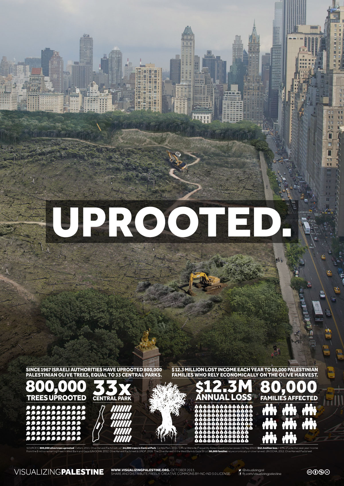
800,000 Olive Trees Uprooted, 33 Central Parks, Polypod and Philippe Ghabayen (CC BY-NC-ND)
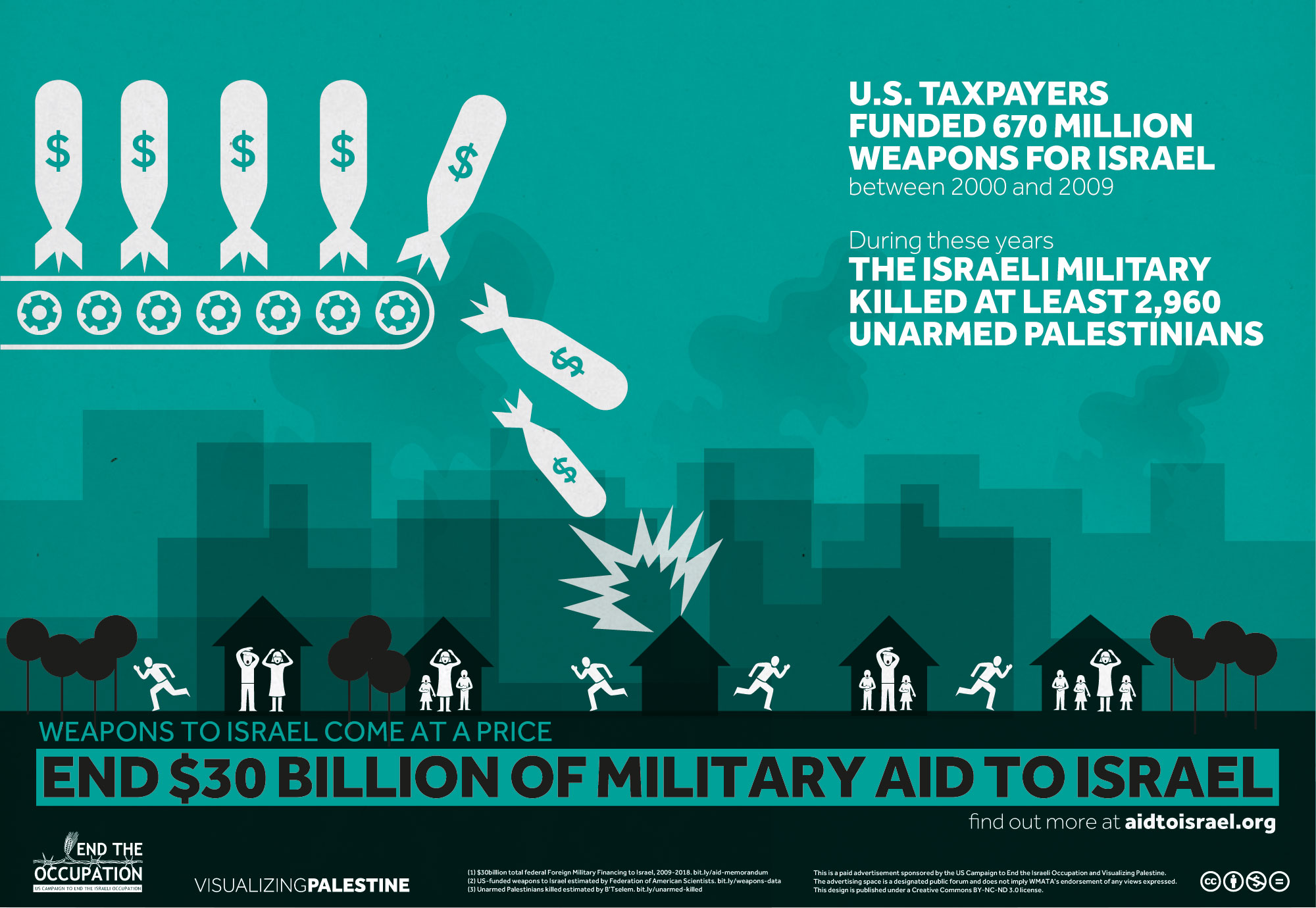
End $30 Billion of US Military Aid to Israel – Weapons, Naji Elmir and Polypod (CC BY-NC-ND)
Visualizing Palestine is a project of Visualizing Impact, working to produce data visualizations and data animations for campaigners and activists.
4 comments